Beauty Center Html/CSS Template Documentation
By: Famous Themes
Table of Contents
- Introduction
- HTML Structure
- CSS Files and CSS Media Queries
- JavaScript
- PSD Files
- Sources and Credits
IMPORTANT
Like any other Html/CSS Template, modifying this template requires some basic Html and CSS knowledge. Some effects used here need also some basic jQuery knowledge and javascript. To edit this template you will need an html code editor, and the best way to do it is in "code" view, not the "design view" option. The general purpose of an Html/CSS template is to give you a starting layout in building your own website. You can use this to create a simple static website with no administration backend, or some people prefer the html templates to integrate them in their own CMS (custom management system), with their own administration tools.
Changing the colors
To change the colors just load the specific style.css file into the header code of each page
For example for the default color (purple) use
<link rel="stylesheet" type="text/css" media="all" href="style.css" />
To use the green color use
<link rel="stylesheet" type="text/css" media="all" href="style-green.css" />
1) Introduction
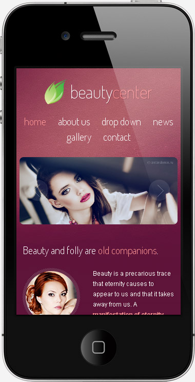
"Beauty Center" is our first beauty related template. We have decided to create for this one a responsive layout to make it look better on all devices including mobiles. The template design is a minimal one with nice simple colors and custom web fonts. Can be used to create a beauty salon website, a spa center website, a hair salon website or any beauty center related website. The layout can be easy to modify, we have provided layout elements to create pages like blog sections, photo gallery, contact form and may more, just read the HELP file to better understand how to do it.
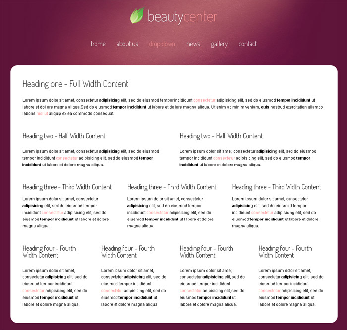
2) HTML Structure - top
The template is using a responsive layout with a fluid grid strating from 960 px width.
The main HTML is included in <div id="main_container">
#main_container{width:960px;margin:auto;}
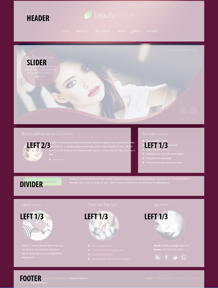
A. Menu, header and title
Menu is a javascript drop down menu with a general UL and LI styles. Javascript file included for the menu is
<script type="text/javascript" src="js/menu.js"></script>
The main HTML structure of the menu:
<div class="menu">
<ul id="main_menu">
<li><a class="selected" href="index.html">home</a></li>
<li><a href="page.html">about us</a></li>
<li><a href="full-width.html">drop down</a>
<ul>
<li><a href="services.html">services page</a></li>
<li><a href="gallery.html">gallery layout</a></li>
<li><a href="full-width.html">full width</a></li>
<li><a href="contact.html">contact form</a></li>
</ul>
</li>
<li><a href="blog.html">news</a></li>
<li><a href="gallery.html">gallery</a></li>
<li><a href="contact.html">contact</a></li>
</ul>
</div>
Header structure is the same on all pages.
In header we have the main logo and the menu
<div class="header">
<div class="logo"><h1><a href="index.html">beauty<span>center</span></a></h1></div>
......
</div>
We have used for this template one font from Google Web Fonts called "Dosis". The font is loaded in the header of HTML page.
<link href='http://fonts.googleapis.com/css?family=Dosis:200' rel='stylesheet' type='text/css' />And they are used in CSS accordenly
h1, h2, h3, h4{font-family: 'Dosis', sans-serif; clear:both;}
B. Home page slider
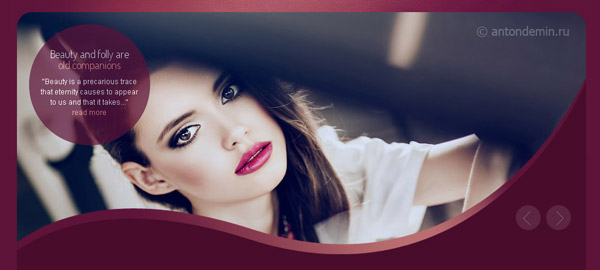
The structure of a slide is
<li>
<a href="#"><img src="images/slider/slide1.jpg" alt="" title=""/></a>
<div class="flex-caption">
<div class="caption_title_line"><h2>Beauty and folly are <br /><span>old companions</span></h2><p>"Beauty is a precarious trace that eternity causes to appear to us and that it takes..." <br /><a href="#">read more</a></p></div>
</div>
</li>
Adding a new <li> will insert a new slide to you slider.
The image of the slide must be 940 x 400 px size and it will be resized automatically down to mobile resolution.
C. Secondary pages
We have provided with this template more html pages with different structures. There are pages with sidebar and pages with full width structures.
For example the ABOUT page layout includes a RIGHT CONTENT div and a SIDEBAR.
The center content of a secondary page start with <div id="page_content">
In CSS we have:
#page_content{ width:960px; height:auto; position:relative; margin:0 0 10px 0; padding:0 0 45px 0; background-color:#ffffff;border-radius:20px;-moz-border-radius:20px; -webkit-border-radius:20px;-khtml-border-radius:20px;}
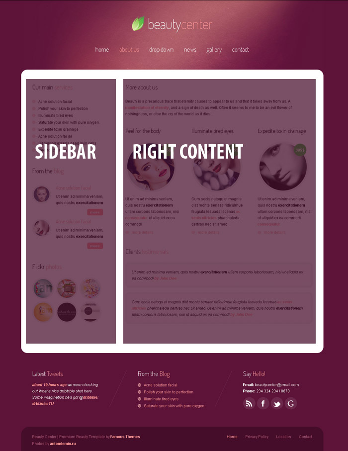
RIGHT CONTENT is the section that will stay floated right.
.right_content{width:595px; float:right; margin:45px 35px 0 0;}
In sidebar we have included structures to build lists, small photo thumbs, testimonials, and any other text content.
.sidebar{ border-right:1px #e9e9e9 solid; width:250px; padding-right:10px;float:left; margin:45px 0 0 35px;}
With this already built layout you can easely integrate a CMS into your website and transform it in a dinamic blog.
There is also a full-width.html page witch contains a lot of other html structures to be used in pages.
The layout can be divided in 1,2,3, or 4 sections using the classes
/* Layout
/*-----------------------------------------------------------------------------------*/
.left_full {margin:40px 35px 0 35px; float:left;}
.left14{ width:196px; float:left; margin:45px 0 0 35px;}
.left13{ width:273px; float:left; margin:45px 0 0 35px;}
.left23{ width:576px; float:left; margin:45px 0 0 35px;}
.left12{ width:427px; float:left; margin:45px 0 0 35px;}
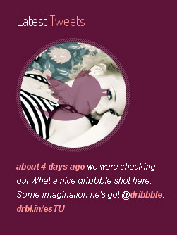
Adding Your Twitter feed
On home page and secondary pages sidebar you have the option to add your live twitter feed. On top javascript code you ca find the lines to edit your twitter username and text apearance details:
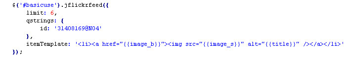
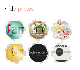
Adding Your Flickr feed
On blog page in sidebar we have added a live flickr feed.
Also on top javascript code of this page you can edit your flickr ID. To find your flickr ID use this website
http://idgettr.com/
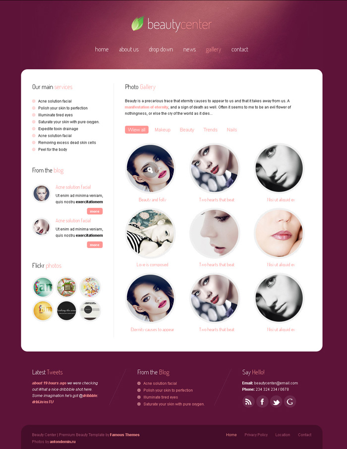
D. Photo Gallery page
We have included the posibility to add a filterable photo gallery page.
On the version with filterable option the structure starts with the selection links
<ul class="filter_portfolio">
<li class="segment-1 selected"><a href="#" data-value="all">Wiew all</a></li>
<li class="segment-2"><a href="#" data-value="makeup">Makeup</a></li>
<li class="segment-3"><a href="#" data-value="beauty">Beauty</a></li>
<li class="segment-4"><a href="#" data-value="trends">Trends</a></li>
<li class="segment-5"><a href="#" data-value="nails">Nails</a></li>
</ul>
folowed by each photo item
<li class="right13 makeup" data-id="id-1">
<div class="center_round_thumb">
<img src="images/thumb150.jpg" alt="" title="" class="thumb150" />
<div class="zoom"><a href="images/slider/slide1.jpg" rel="prettyPhoto[gallery]" title="Lorem ipsum sit amet"><img src="images/zoom.png" alt="" title="" /></a></div>
</div>
<h3><a href="#">Beauty and folly</a></h3>
</li>
As you can see each item has an data-value="makeup"attribute linked to a selectin link<li class="gallery13 makeup" data-id="id-1">
When clicking the ceremonyselection link all ceremony photos will remain selected.
On hover we have add prettyphoto effect for each photo. To add the big images url you will need to edit the line
<a href="images/slider/slide1.jpg" rel="prettyPhoto[gallery]" title="Lorem ipsum sit amet">
The big photo beeing "slide1.jpg" and the description text on popup window title="Lorem ipsum sit amet"
E. Contact page
We have provided with this template 2 contact pages, one is with a simple html/css form and one with a php functional contact form (contact.php).
The php form is validating his inputs using jquery.validate.js file from JS theme folder.
In header we have the code that validates the inputs and loads the js code:
<script type="text/javascript" src="js/jquery.validate.js"></script>
<script type="text/javascript">
$(document).ready(function() {
$("#form1").validate({
rules: {
name: "required",// simple rule, converted to {required:true}
email: {// compound rule
required: true,
email: true
},
comment: {
required: true
}
},
messages: {
comment: "Please enter a message."
}
});
});
</script>
And the first lines of code are the ones that actually sends the email
<?
session_start();
if(isset($_POST['submitted'])) {
$name = trim($_POST['name']);
$phone = trim($_POST['phone']);
$email = trim($_POST['email']);
$comment = trim($_POST['comment']);
$emailTo = "bbbooogggs@gmail.com";
$subject = 'Contact message from '.$name;
$body = "Name: $name \n\n Email: $email \n\n Phone: $phone \n\n Message: $comment";
$headers = 'From: $name <'.$emailTo.'>' . "\r\n" . 'Reply-To: ' . $email;
@mail($emailTo, $subject, $body, $headers);
$emailSent = true;
}?>
Adding the email where you want to receive your messages here
$emailTo = "bbbooogggs@gmail.com";
3) CSS Files - top
We are using 2 main CSS files for this template. All the CSS files are included in header of pages:
Main CSS file is:
<link rel="stylesheet" type="text/css" media="all" href="style.css" />
PrettyPhoto CSS file:
<link rel="stylesheet" href="prettyphoto/prettyPhoto.css" type="text/css" media="screen" title="prettyPhoto main stylesheet" charset="utf-8" />
Here you can find all the styles use for popup images. We recommand not to edit this file unless you have good CSS skils.
The main CSS file is very well organized, it start's with reset code and continues with all the general classes. The code is written inline for speed reasons. We know that your website will load faster with the CSS written like this.
The code starts with general setup style and continues down to footer style and finally at the end CSS Media Queries code
/* General Setup
/*-----------------------------------------------------------------------------------*/
body{font-family:Arial, Helvetica, sans-serif;padding:0;font-size:12px;margin:0 auto;color:#000000;background:url(images/bg.jpg) no-repeat top center #5d1338;}
.clear{clear:both;}
p{padding:0;margin:0px;text-align:left;line-height:20px;}
a{color:#ff9694; text-decoration:none;}
.......
/* Footer
/*-----------------------------------------------------------------------------------*/
.footer{width:960px; margin:55px 0 0 0px; padding:20px 0 15px 0; background-color:#460d29; clear:both; float:left;
-moz-border-radius-topleft:25px;-webkit-border-top-left-radius:25px;-khtml-border-top-left-radius:15px;border-top-left-radius:25px;
-moz-border-radius-topright:25px;-webkit-border-top-right-radius:25px;-khtml-border-top-right-radius:15px;border-top-right-radius:25px;}
/* Media Queries
/*-----------------------------------------------------------------------------------*/
@media screen and (max-width: 960px) {
#main_container{width:100%;}
.header{ text-align:center; height:auto; padding:20px 0 0 0;}
......
.left_full, .left13, .left23, .left12, .left14{ width:90%; float:left; margin:40px 0 0 5%;}
........
}
We are using for this template also CSS Media Queries that allows the template to be viewed on all device resolutions inluding mobile.
We have build in this template a smart fluid grid system. The system is using html classes named by their sizes. Like <div class="left12"> witch is a half section of content. Or <div class="left13"> witch is used on home page in the 3 sections below the slider.
Starting from this smart sections you can easily build your own html strucure perfectly aligned and spaced.
/* Layout
/*-----------------------------------------------------------------------------------*/
.left_full {margin:40px 35px 0 35px; float:left;}
.left14{ width:196px; float:left; margin:45px 0 0 35px;}
.left13{ width:273px; float:left; margin:45px 0 0 35px;}
.left23{ width:576px; float:left; margin:45px 0 0 35px;}
.left12{ width:427px; float:left; margin:45px 0 0 35px;}
If you would like to edit other specific section of the site, simply find the appropriate label in the CSS file, and then scroll down until you find the appropriate style that needs to be edited.
4) JavaScript - top
This template imports more Javascript files. All the files can be found in "JS" folder. The files are included betwen HEAD tags of the html content.
On home page we are including:
<!-- jQuery -->
<script type="text/javascript" src="https://ajax.googleapis.com/ajax/libs/jquery/1.6.2/jquery.min.js"></script>
<!-- FlexSlider -->
<script type="text/javascript" src="js/jquery.flexslider-min.js"></script>
<!-- Twitter Feed -->
<script type="text/javascript" src="js/jquery.tweet.js" charset="utf-8"></script>
<!-- DropDownMenu -->
<script type="text/javascript" src="js/menu.js"></script>
<script type="text/javascript" charset="utf-8">
var $ = jQuery.noConflict();
$(window).load(function() {
$('.flexslider').flexslider({
animation: "fade"
});
});
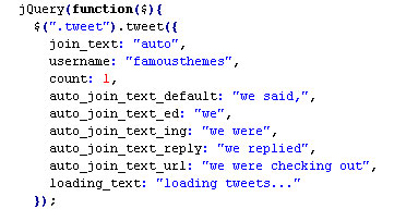
jQuery(function($){
$(".tweet").tweet({
join_text: "auto",
username: "famousthemes",
count: 1,
auto_join_text_default: "we said,",
auto_join_text_ed: "we",
auto_join_text_ing: "we were",
auto_join_text_reply: "we replied",
auto_join_text_url: "we were checking out",
loading_text: "loading tweets..."
});
});
</script>
The scripts are used for drop down menu, flexi slider, twitter feed
And in the bottom of tha page
<script type="text/javascript">var main_menu=new main_menu.dd("main_menu");
main_menu.init("main_menu","menuhover");
</script>
used to setup the main drop down menu.
Other javascript files are inclued on pages like:
1. Photo Gallery page is using some extra javascript files included like:
<!-- Sortable -->
<script type="text/javascript" src="js/jquery.quicksand.js"></script>
<script type="text/javascript" src="js/custom.quicksand.js"></script>
for filterable effect
and
<script src="js/jquery.prettyPhoto.js" type="text/javascript" charset="utf-8"></script>
for lightbox effect of the images.
We recomand NOT to edit this js files only if you have minimum JS knowledge
5) PSD Files - top
We have included with this template the main page PSD file.
The PSD's is well organized on named group layers, if you want to modify something just go to the specific layer. There are hidden layers for some blog and gallery design elements.
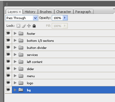
Keep in mind that you will have to save the final files from PSD to the same image format and size as they are now. Otherwise you will have to edit the specific html and CSS files.
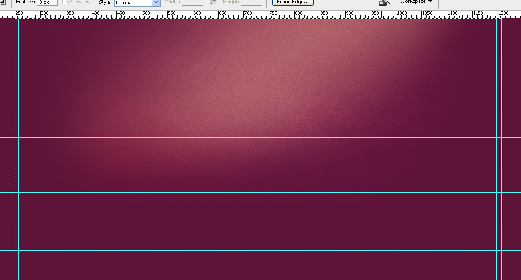
For example the background image used for body tag bg.jpg.
body{font-family:Arial, Helvetica, sans-serif;padding:0;font-size:12px;margin:0 auto;color:#000000;background:url(images/bg.jpg) no-repeat top center #5d1338;}

In CSS we have:
body{font-family:Arial, Helvetica, sans-serif;padding:0;font-size:12px;margin:0 auto;color:#000000;background:url(images/bg.jpg) no-repeat top center #5d1338;}
From the photoshop file you must export the bg image as jpg.
6) Sources and Credits - top
- jQuery code --- http://jquery.com/
- Prettyphoto --- http://www.no-margin-for-errors.com/projects/prettyphoto-jquery-lightbox-clone/
- FlexSlider --- http://www.woothemes.com/flexslider/
- Filterable Portfolio --- http://razorjack.net/quicksand/
- Twitter feed --- http://tweet.seaofclouds.com/
- Flickr feed --- http://www.gethifi.com/blog/a-jquery-flickr-feed-plugin
- Google Web Fonts